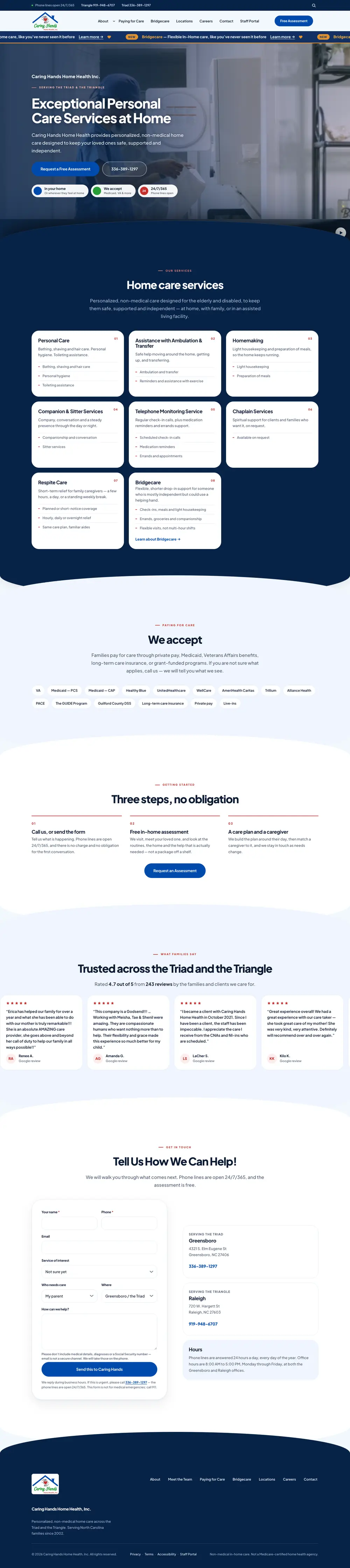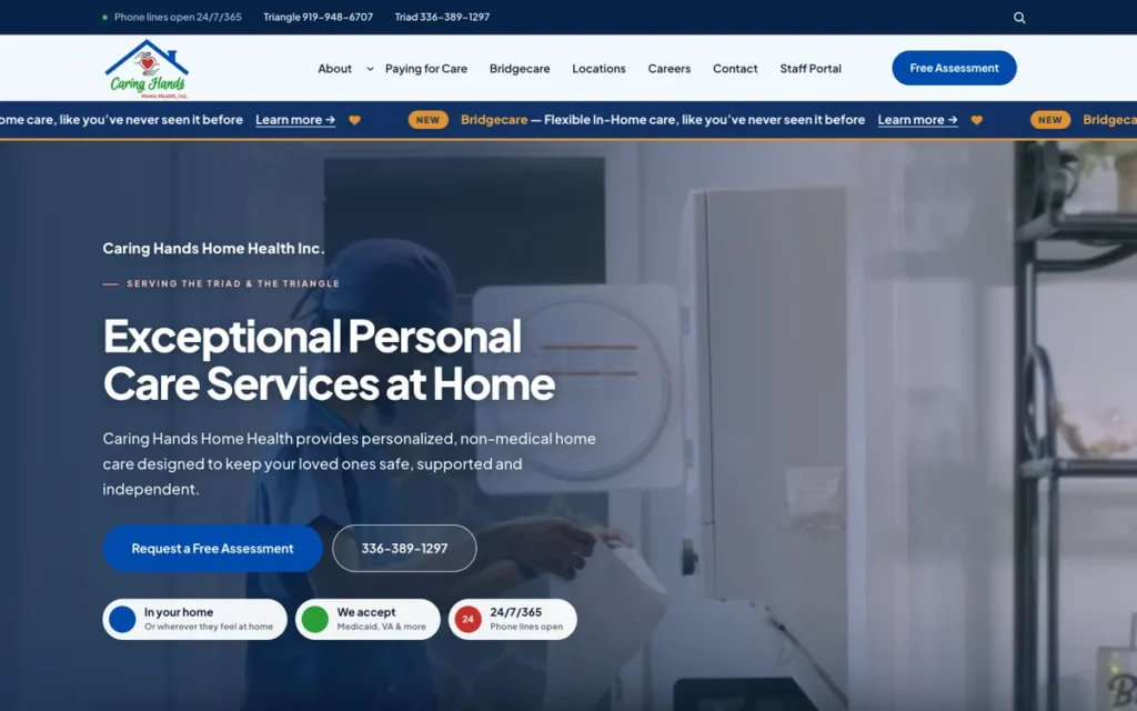

Families usually find a home-care provider in the middle of a hard week. The site needed to answer three questions fast — what do you do, can we pay for it, and how do we talk to someone — while feeling as warm as the people who answer the phone.
Design decisions
- Phone lines for both regions sit above the navigation on every page, and stay reachable on mobile.
- Services are organized as eight plain-language cards, each listing what’s actually included.
- Payment options (Medicaid, VA, insurance, private pay and more) are listed openly instead of hidden behind a call.
- A three-step “no obligation” path explains exactly what happens after you reach out.
- The contact form warns visitors not to send medical details over email.